Seven building blocks that decide whether a design works… or falls flat
Every piece of visual work that stops you in your tracks (a brand logo, a website, a magazine layout, a storefront, a product package) rests on the same seven elements. These are not abstract theory. They are practical tools that professional designers use every day to solve real client problems.
Learn them, and you will know exactly why one layout feels clean and trustworthy while another feels chaotic and cheap.
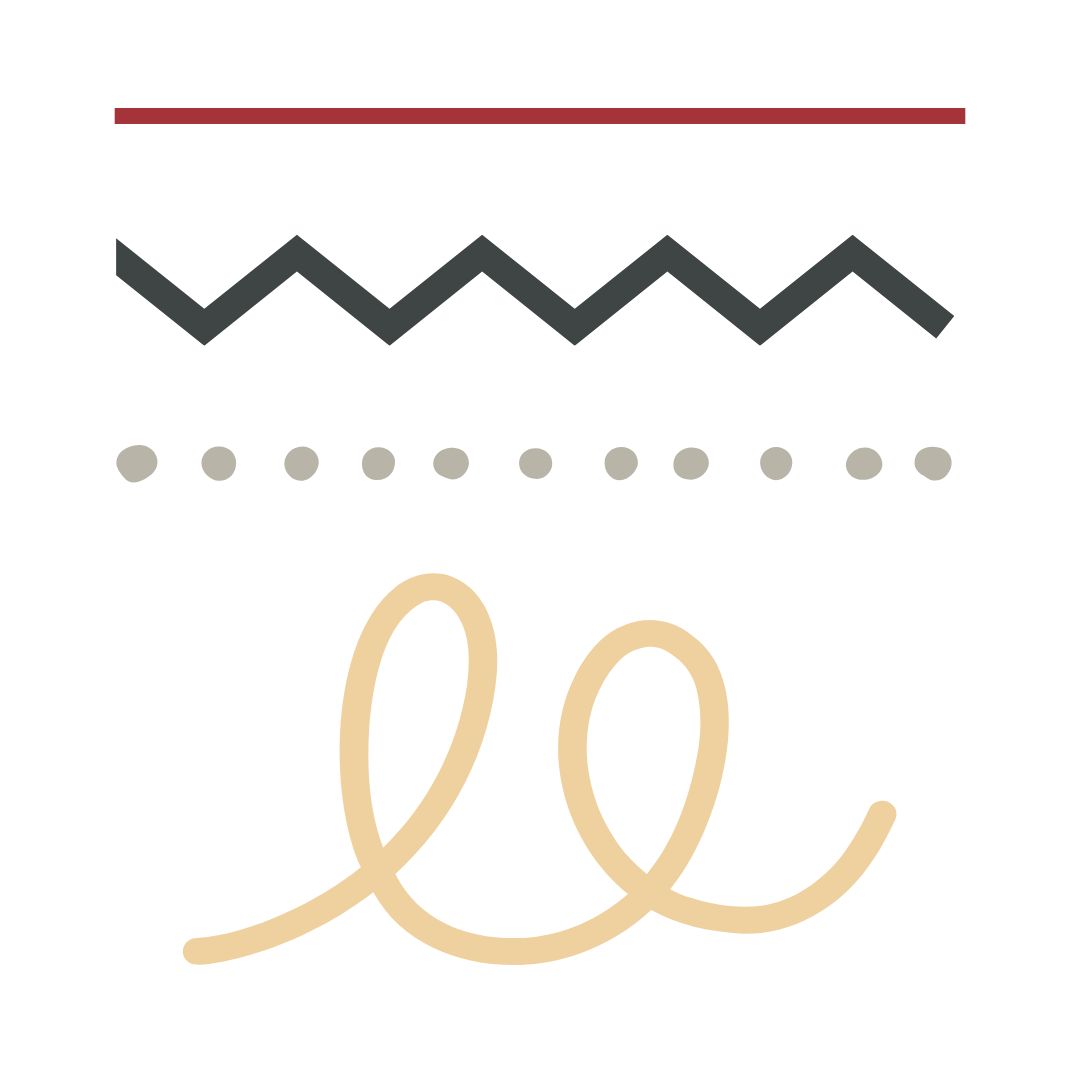
Line
The simplest mark you can make, yet it does heavy lifting. Horizontal lines feel stable and calm (think horizons). Vertical lines suggest strength and growth. Diagonals create movement and tension. Curved lines feel friendly and organic. Thick lines grab attention. Thin lines feel refined. Even the absence of a visible line (implied by aligned edges) guides the viewer’s eye exactly where the designer wants it.

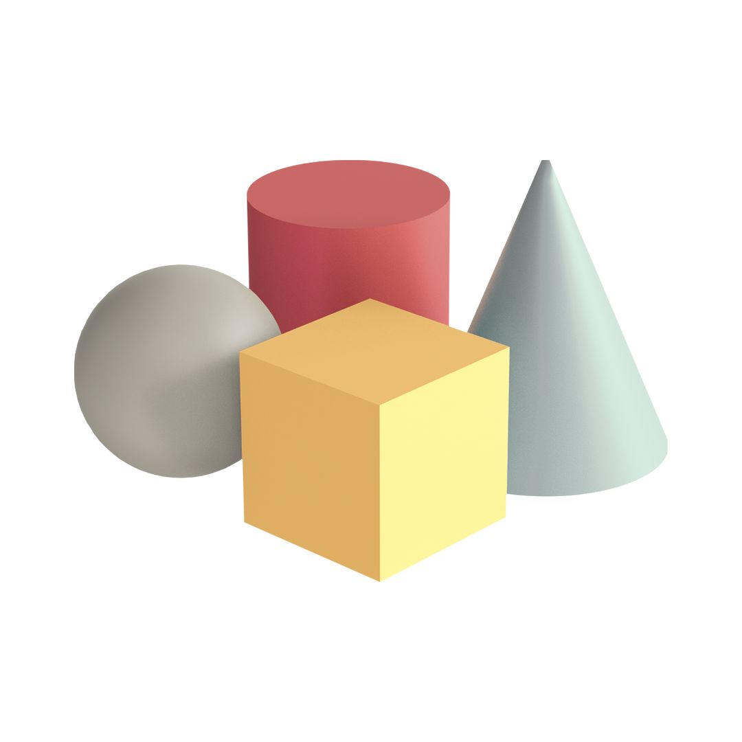
Shape
When a line closes or areas of colour meet, you get shape. Geometric shapes (circles, squares, triangles) feel ordered, modern, and man-made. They work perfectly for tech brands and corporate work. Organic shapes are irregular and flowing. They suit beauty, food, or lifestyle brands. Shapes create the “things” in your design: icons, photo frames, buttons, decorative elements, or the overall silhouette of a layout.
Form
Shape with the illusion of volume. In flat digital or print work, we add shading, highlights, gradients, and perspective so a circle stops looking like a flat disk and starts looking like a sphere or button you could press. Form makes logos feel premium, products feel tangible, and interfaces feel three-dimensional even on a phone screen.

Colour
The fastest way to trigger emotion and recognition. Colour has three controllable properties:
- Hue (is it red, blue, green?)
- Value (light sky blue vs dark navy)
- Saturation (vibrant neon vs soft pastel)
Luxury brands often use low-saturation, high-value colours for sophistication. Fast-food brands go high-saturation and warm to stimulate appetite. One wrong hue and your “trustworthy financial brand” suddenly feels childish.
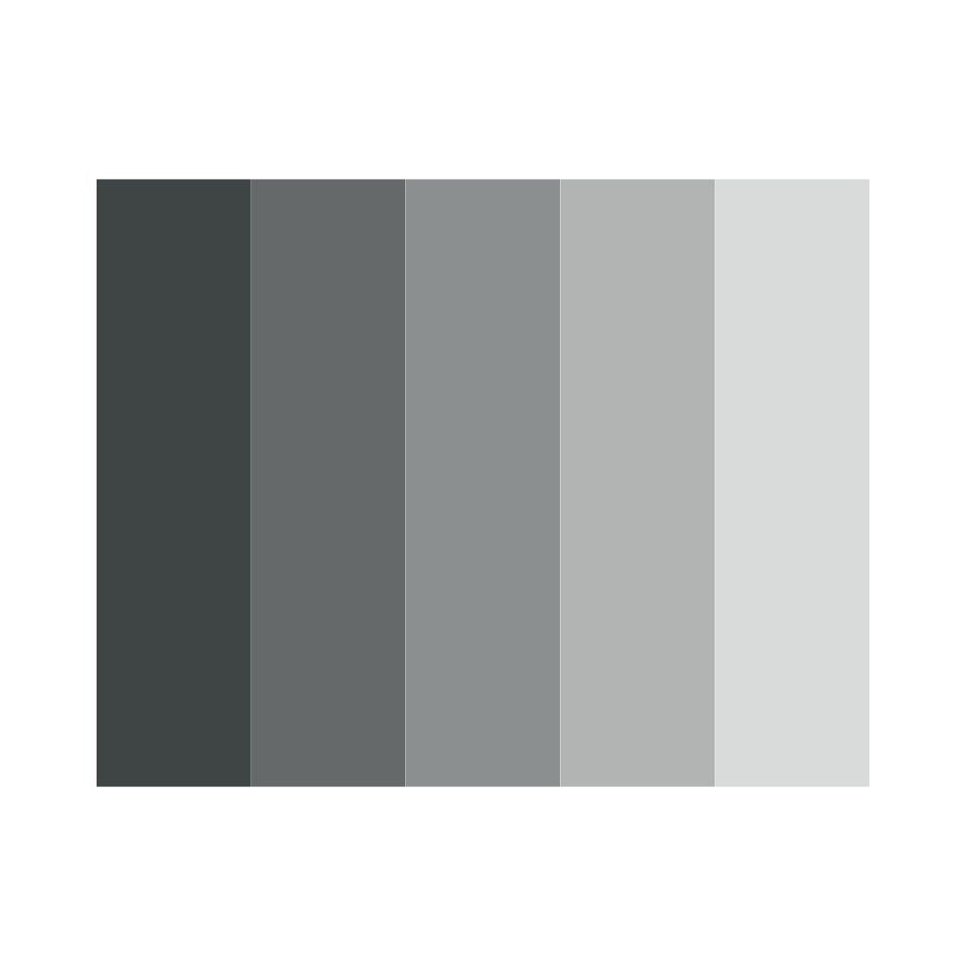
Value
How light or dark any area is, regardless of colour. Strong value contrast makes text readable and creates clear focal points (think a dark call-to-action button on a light background). Subtle value differences create depth and elegance. A design with poor value structure looks muddy even if the colours are beautiful.
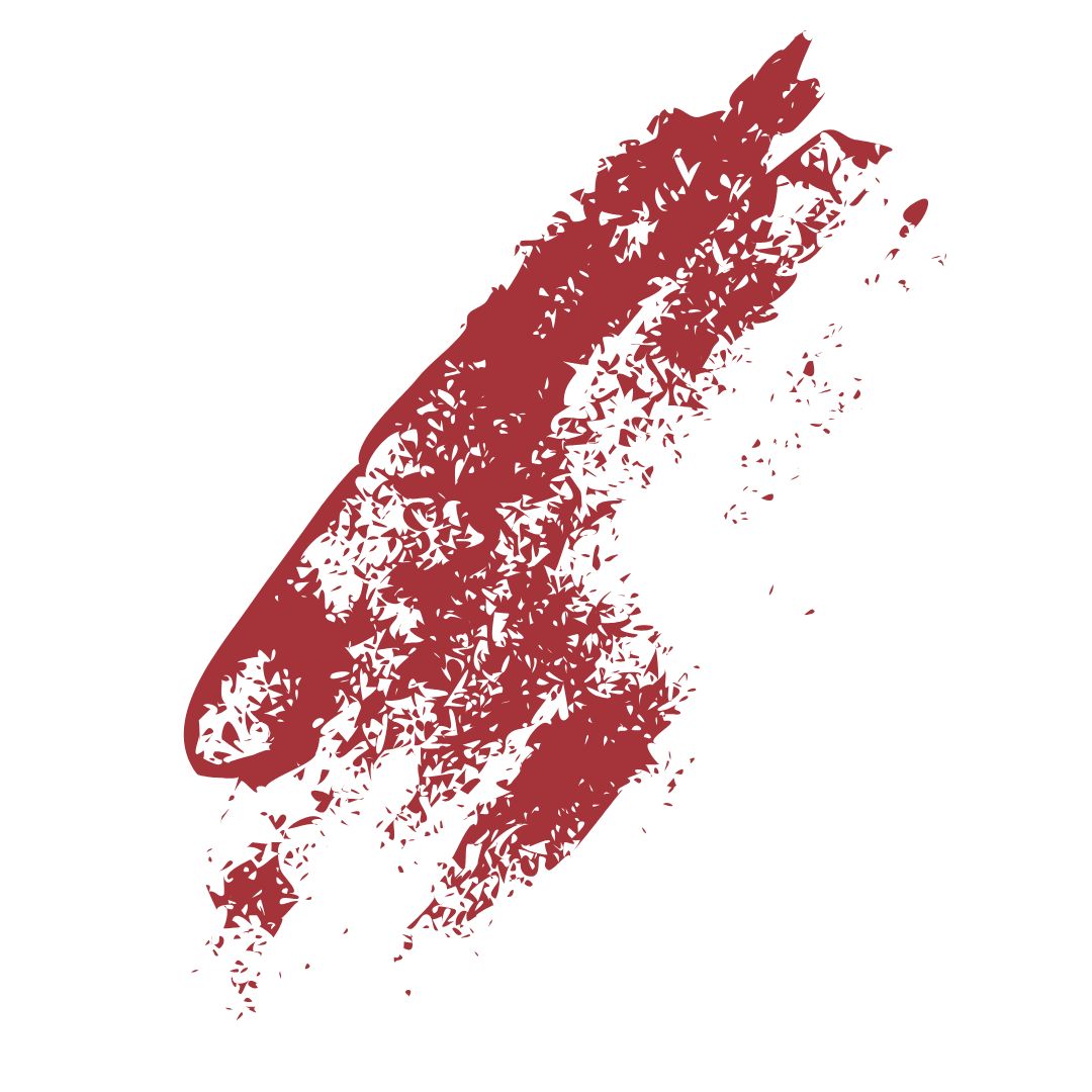
Texture
The surface quality you see or feel. Paper grain, leather, brushed steel, watercolour wash, concrete. Texture adds character and realism. In digital work it is usually simulated with photos or patterns. In print it can be literal (foil, embossing, soft-touch coating). The right texture can make an affordable piece feel expensive or a tech product feel warm and approachable.
Space (positive and negative)
Positive space is the stuff (text, images, logos). Negative space is everything else. Generous negative space screams luxury and confidence (think Apple or Chanel). Tight space feels energetic and affordable (think sale flyers). Smart use of negative space is often what separates amateur layouts from professional ones. Everything suddenly becomes easier to read and more impactful.
These seven elements are the universal vocabulary of visual communication. They show up in every brief, every mood board, and every client presentation.
Master them, and you design with intention. Ignore them, and you design by chance.