Visuals are everywhere and every design choice communicates something, whether intentionally or not. Visual hierarchy is the system that brings order, clarity and calm to that communication. Instead of making your audience work to understand your message, hierarchy creates a clear path for the eye to follow, helping people absorb information naturally as they move through the design.
Strong hierarchy feels almost invisible. It quietly directs attention, reduces cognitive strain and prevents the sort of visual fatigue that often causes people to scroll past or abandon a page. Whether you are creating a website, social post or print layout, hierarchy is the tool that cuts through noise and gives every element a purposeful place.
For clients, this means your message is understood faster and remembered longer. For designers, it is the foundation of layouts that feel confident, balanced and professional.
Below is a set of refined, practical principles that show exactly how hierarchy works and how it can elevate your communication across graphic design, web design and even logo development.
Here are the key principles Visual Hierarchy.
Focal Point
Every design needs one clear moment of importance, the visual anchor that tells the viewer where to begin. A strong focal point gives direction and sets the visual tone for the rest of the layout. When this point is defined intentionally, the surrounding elements feel more cohesive and the overall message becomes far easier to understand.

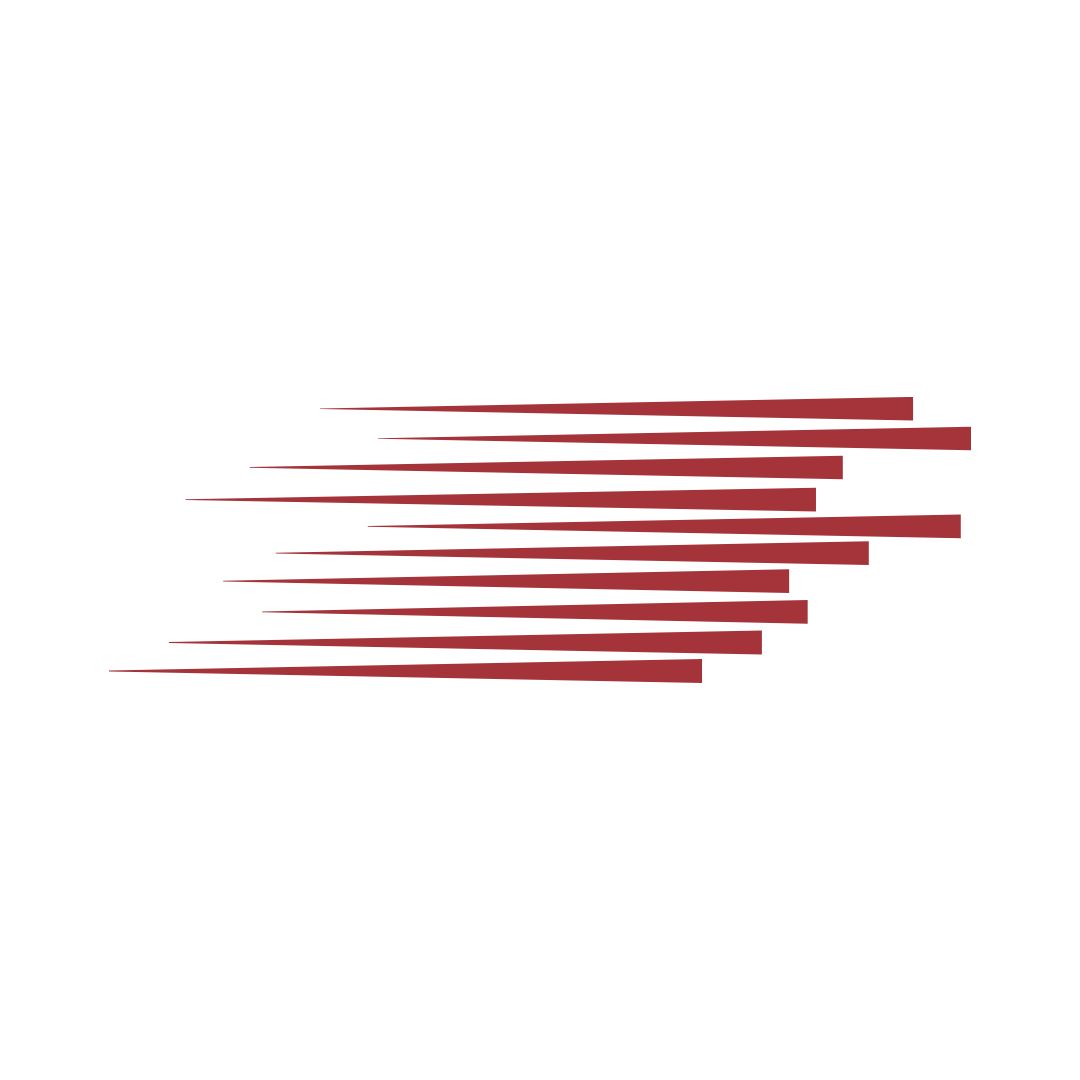
Movement
Hierarchy shapes how the viewer travels through your design. By creating a controlled flow, you guide the eye from one element to the next in a sequence that supports your message. Effective movement feels natural, not forced, and helps your audience absorb information in the order that best supports clarity and persuasion.
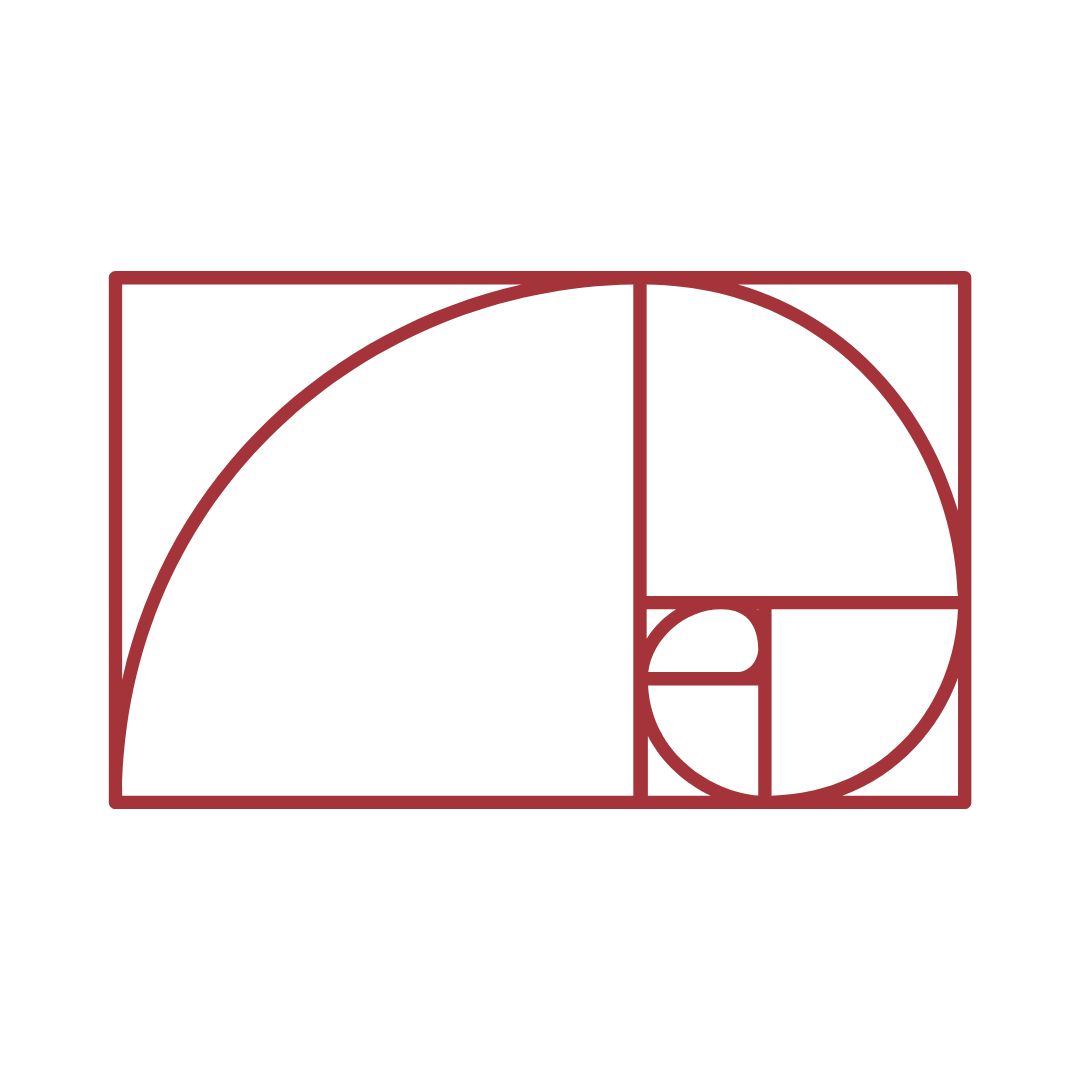
Golden Ratio
Natural proportions create a sense of balance that feels immediately pleasing, even to viewers who have never heard of the Golden Ratio. By using these proportions in layouts, imagery or logo construction, your design gains a level of harmony and refinement that is difficult to achieve through guesswork alone.
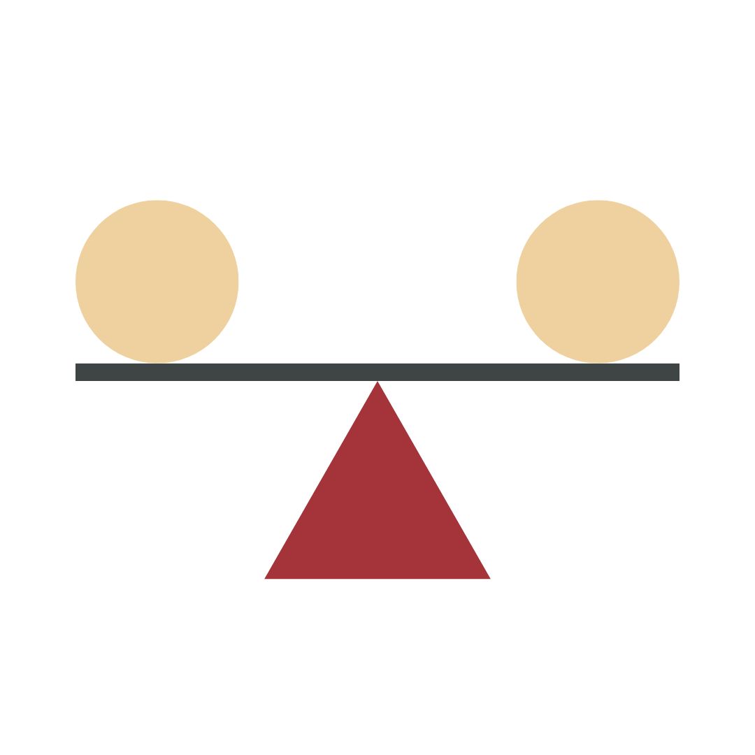
Balance
Balance ensures that no part of your design feels too heavy or too light. When visual weight is considered carefully, the composition feels stable and trustworthy. Good balance does not mean elements are symmetrical, but that they are distributed in a way that supports calm, confident communication.
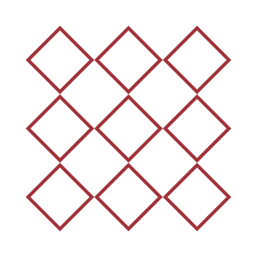
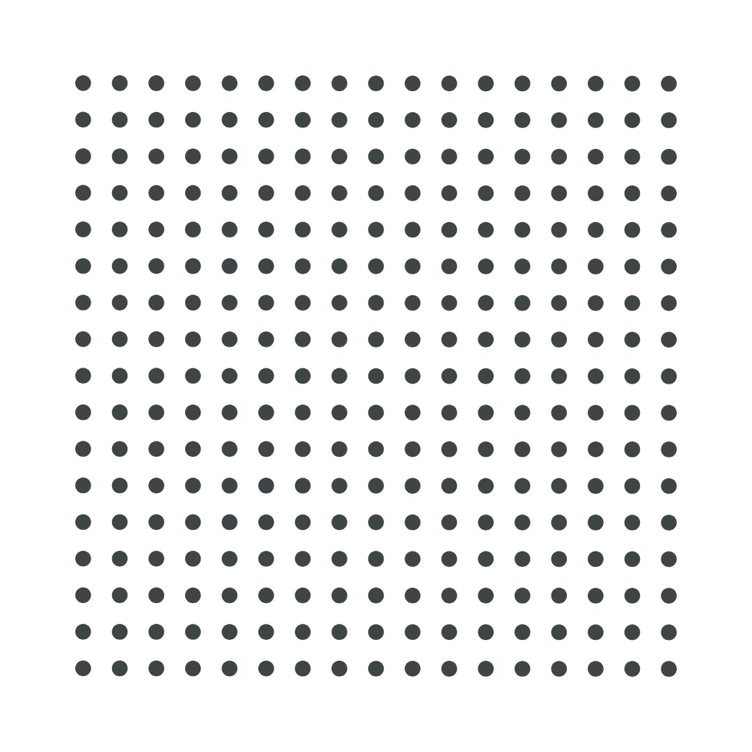
Repetition
Repeating shapes, colours or typographic styles strengthens unity and helps your audience recognise patterns quickly. Repetition reduces cognitive load and ensures important messages are reinforced without needing to compete for attention.
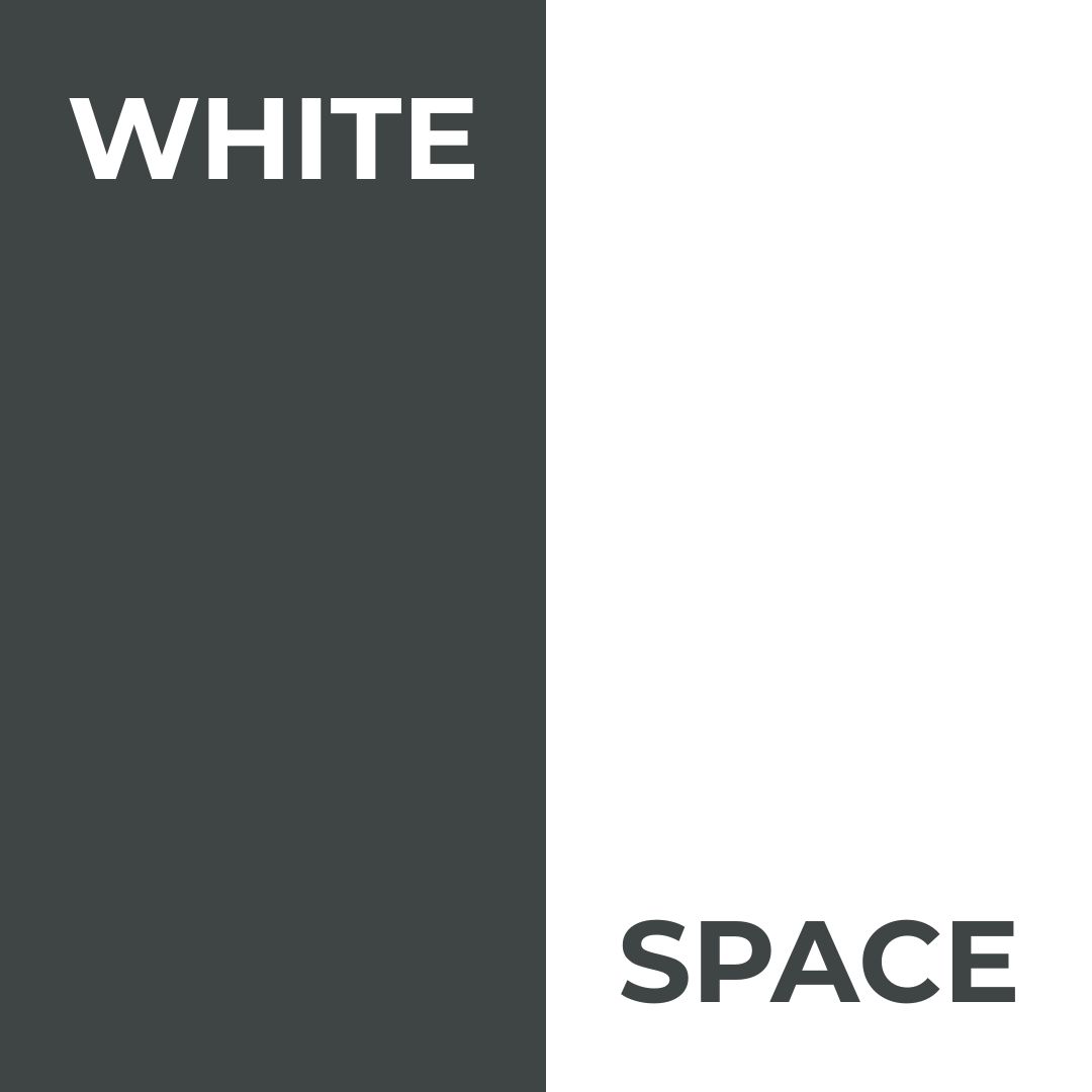
White Space
White space is one of the strongest tools for clarity. It provides breathing room, highlights the content that matters and helps viewers process information without feeling overwhelmed. White space does not mean empty; it means intentional. It is the difference between a design that feels cluttered and one that feels refined.
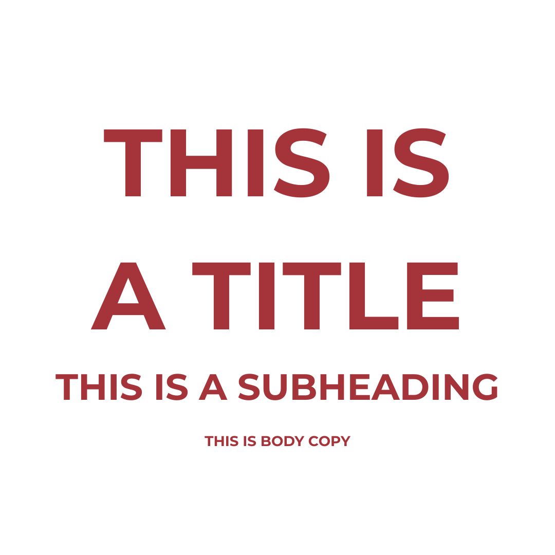
Typographic Hierarchy
Typography is a complete hierarchy system on its own. Using size, weight, spacing and style, you can guide the reader through different layers of information. Strong typographic hierarchy allows someone to scan quickly and still understand the core message, even before reading the details.
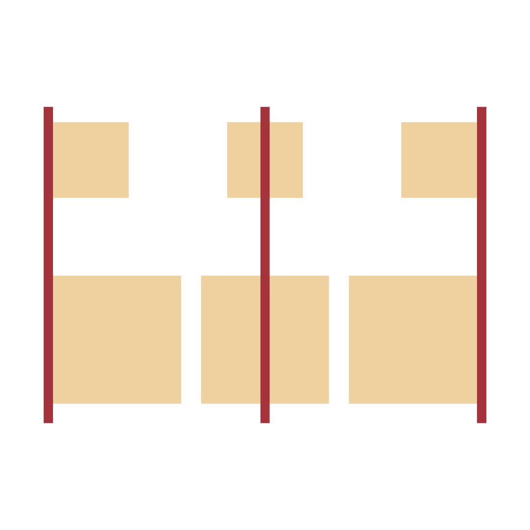
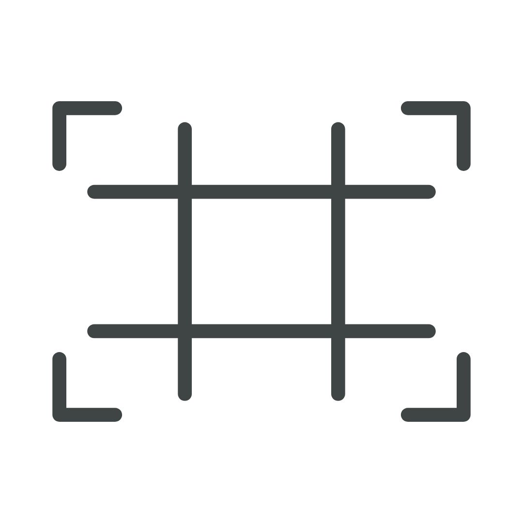
Rules and Systems
Consistent systems form the backbone of organised layouts. Grids, spacing scales and repeatable patterns reduce visual clutter and create predictability, which helps your audience navigate information more easily. These systems act as the quiet structure behind every polished design.
Alignment
Alignment keeps elements connected and visually related. When alignment is intentional, the design feels stable and professional. When it is ignored, even strong ideas appear messy. Clean alignment supports hierarchy by directing attention in straight, confident paths.
Lines
Lines help shape structure by dividing sections, reinforcing flow or highlighting specific elements. They can be bold or subtle, decorative or functional, but their purpose is always to support clarity. Lines create direction without relying on heavy visual cues.
Contrast
Contrast is one of the quickest ways to create emphasis. Using differences in size, colour, shape or weight, you highlight what matters most. The key is balance: too much contrast creates noise, while too little creates monotony. Thoughtful contrast strengthens communication without overwhelming the viewer.

Rule of Thirds
Dividing the layout into thirds helps you position elements with clarity and intention. This structure ensures that each part of the design carries its own visual importance while maintaining harmony across the page. It is particularly effective in photography, hero sections and larger compositions where balance is essential.
Why this matters for your brand
People do not read every word on a page. They scan. When your hierarchy supports that natural behaviour, your communication becomes clearer, more persuasive and more enjoyable to experience.
For clients, this means:
- Stronger brand trust
- Higher-quality perception
- Improved engagement and conversions
- More confident, memorable messaging
For designers, good hierarchy is a professional discipline. It turns intention into clarity and moves the work beyond decoration into meaningful communication.
In a world saturated with visuals, hierarchy is what makes yours truly connect.