
What does Serif and Sans Serif mean?
Serif and sans-serif are the two broad families that shape most of the type we see every day. The difference is simple on the surface yet it influences how a brand feels, how easily text is read and how professional or approachable a design appears. Understanding the distinction helps clients make clearer decisions and helps designers set type with greater intention.
What Makes a Typeface Serif
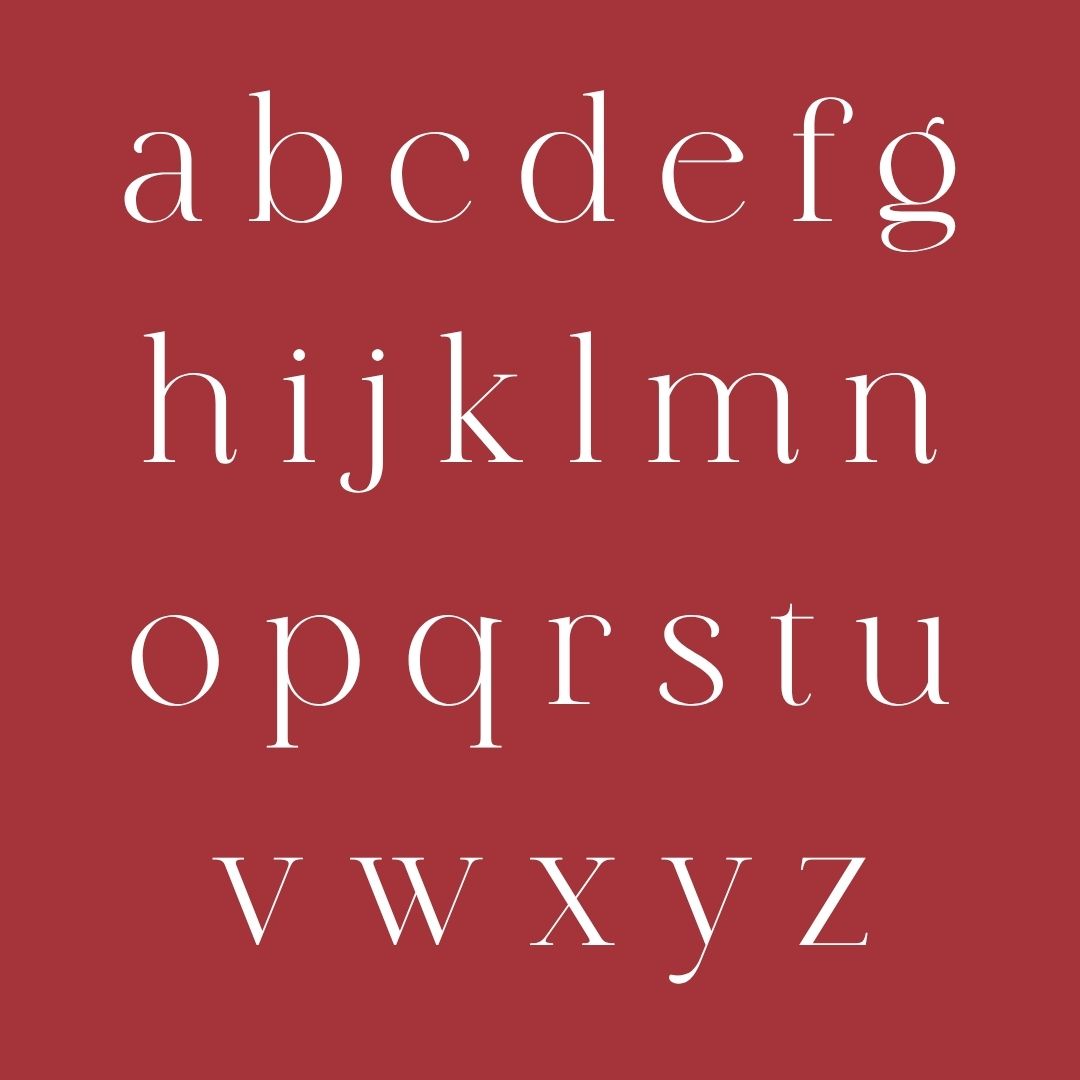
Serif typefaces have small projecting strokes, or “feet,” at the ends of the main letterforms. These details create a sense of tradition, warmth and established authority. Classic examples include Times New Roman, Garamond and Georgia. Serifs often feel more formal or literary and can give long passages of text a refined, readable rhythm on paper.
What Makes a Typeface Sans-Serif
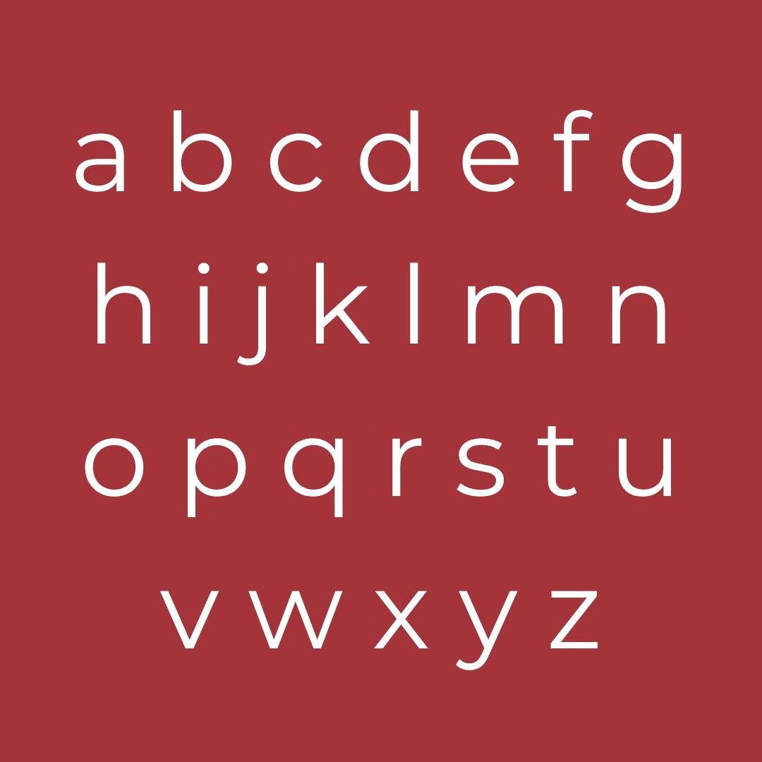
Sans-serif typefaces have none of those finishing strokes. The letterforms are cleaner and more geometric. Helvetica, Arial, Futura and Inter are familiar examples. Sans-serifs tend to feel modern, neutral and efficient. They perform especially well on screens and at smaller sizes because the open shapes remain clear even under less-than-ideal conditions.
Why the Choice Matters for Businesses
Type is one of the quietest yet most constant signals a brand sends. A serif can suggest heritage, craft or luxury. A sans-serif can signal clarity, innovation or approachability. When the choice aligns with the brand’s personality, the visual language feels coherent and trust builds more easily. When it clashes, the design creates a small but persistent sense of friction. Clients who understand this distinction can brief more precisely and evaluate design work with greater confidence.
Practical Considerations for Designers
The decision is rarely pure aesthetics. Screen resolution, reading distance, text length and hierarchy all play a part. Serifs can lose definition at very small sizes or on low-resolution displays if the weight and contrast are not carefully controlled. Sans-serifs can feel generic if the chosen family lacks distinctive proportions or if every level of hierarchy uses the same weight. Good practice is to test both styles in the actual contexts they will appear, then adjust size, tracking and weight until legibility and personality sit comfortably together.
Common Pitfalls
Guide the eye with size, contrast, and spacing rather than cramming everything in. Hero imagery or video should support (not compete with) the message, while secondary sections flow logically downward.
This creates a calm, premium feel that reassures clients your business runs smoothly. A cluttered homepage signals chaos; breathing room signals confidence and control – a subtle but powerful differentiator in our industry.
Raising the Standard
When serif and sans-serif are selected with clear reasons, the entire design system feels more deliberate. Clients notice the coherence even if they cannot name the typefaces. Designers recognise the care. The result is work that communicates more clearly and stands out for the right reasons.
Choose the family that supports the message and the medium, then refine the details until the type does its job without drawing unnecessary attention to itself. That combination of understanding and craft is what turns a basic type decision into a quiet strength for any brand.