Timeless rules that make good design great
Design is everywhere. From the phone in your hand to the billboard you pass on the highway, someone made deliberate choices about how it looks and works. Those choices are guided by a set of core principles that have stayed remarkably consistent for decades.
Whether you create designs professionally or commission them, understanding these principles helps everything look sharper, work better, and feel just right.
Here are the key principles of design, explained simply with real-world examples.
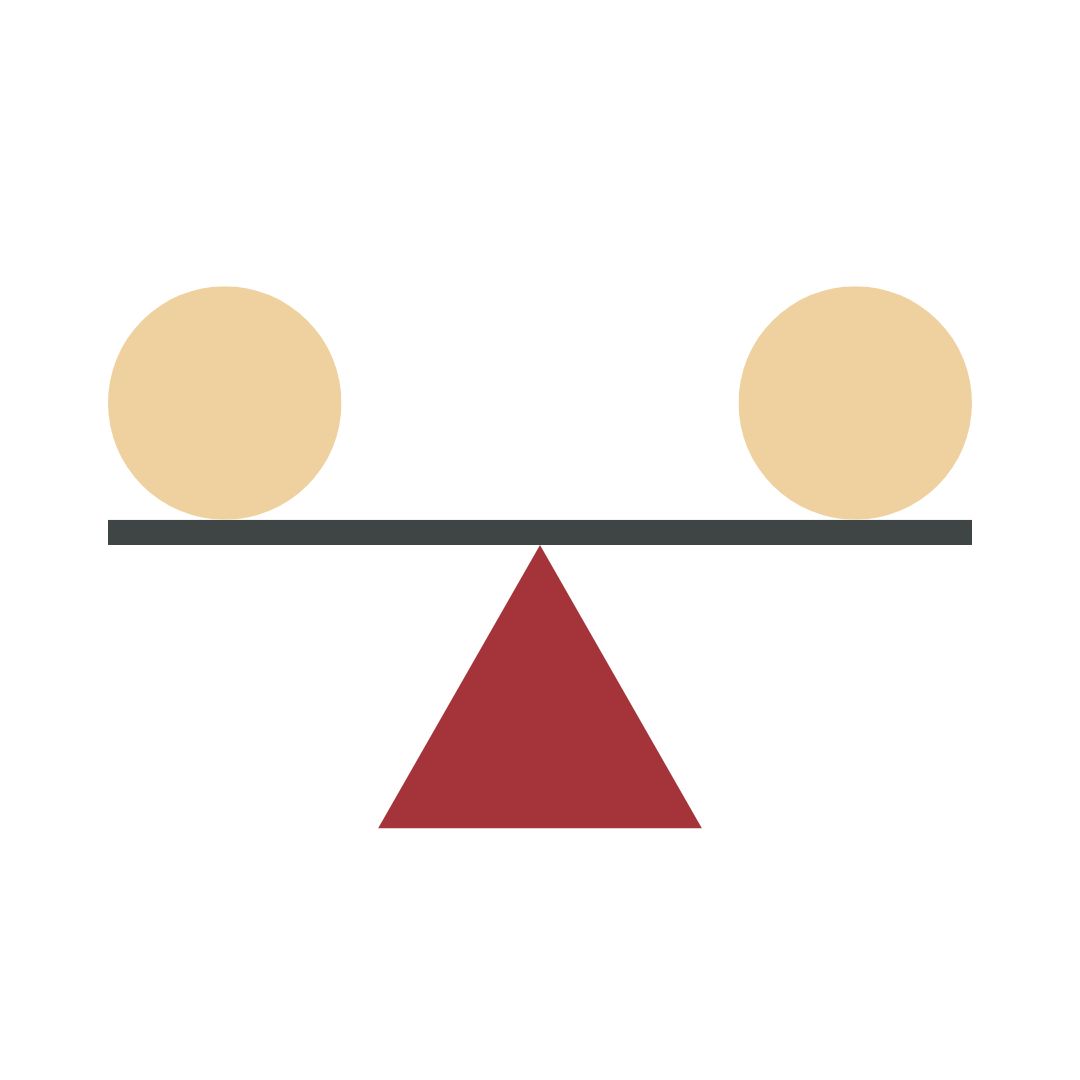
Balance
Balance is about distributing visual weight evenly. It can be symmetrical (mirror-image calm, think of the Apple logo), asymmetrical (more dynamic, like a bold headline offset by a subtle illustration), or radial (elements radiating from a centre point, like a mandala or a car wheel). Poor balance feels unsettling; good balance feels right even if you can’t say why.

Contrast
Contrast creates visual interest and hierarchy. Use it with colour (black text on white), size (huge headline, tiny footnote), texture, shape, or even concept (old typewriter font next to sleek sans-serif). Remember: if everything shouts, nothing gets heard.
Emphasis
Every design needs a star. Emphasis tells the viewer where to look first. You create it through contrast, colour, scale, isolation, or placement. The banner image on a landing page, the call-to-action button in bright orange; these are deliberate acts of emphasis.

Movement
Movement guides the viewer’s eye through the composition. Lines, shapes, colour gradients, and even implied direction (a model looking toward the product) create flow. Great movement feels natural, like reading a story instead of jumping randomly across the page.
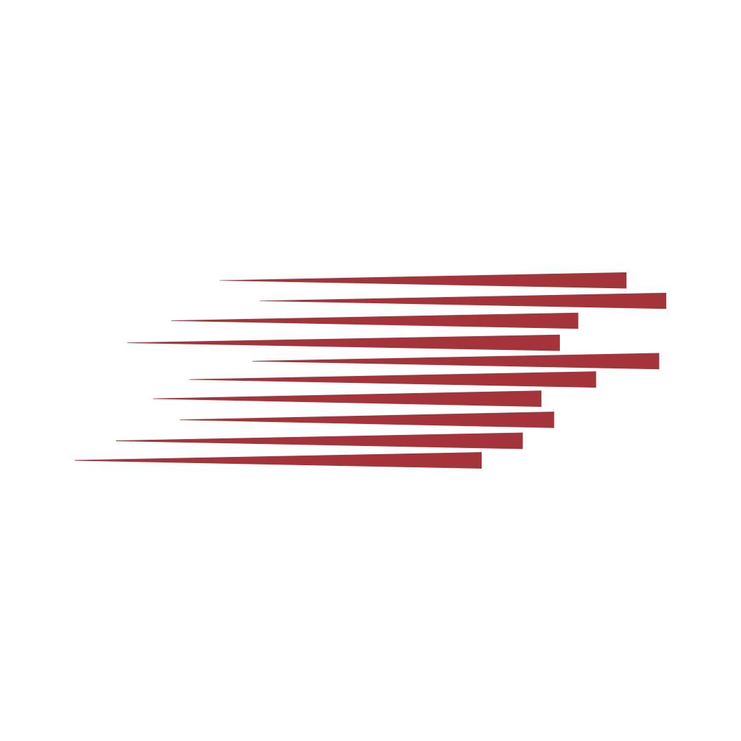
Rhythm
Just like music, design has rhythm. Repeating elements (colours, shapes, textures) at regular or progressing intervals creates visual tempo. Think of alternating image/text blocks in a magazine layout or the predictable pattern of tiles in a beautiful bathroom.


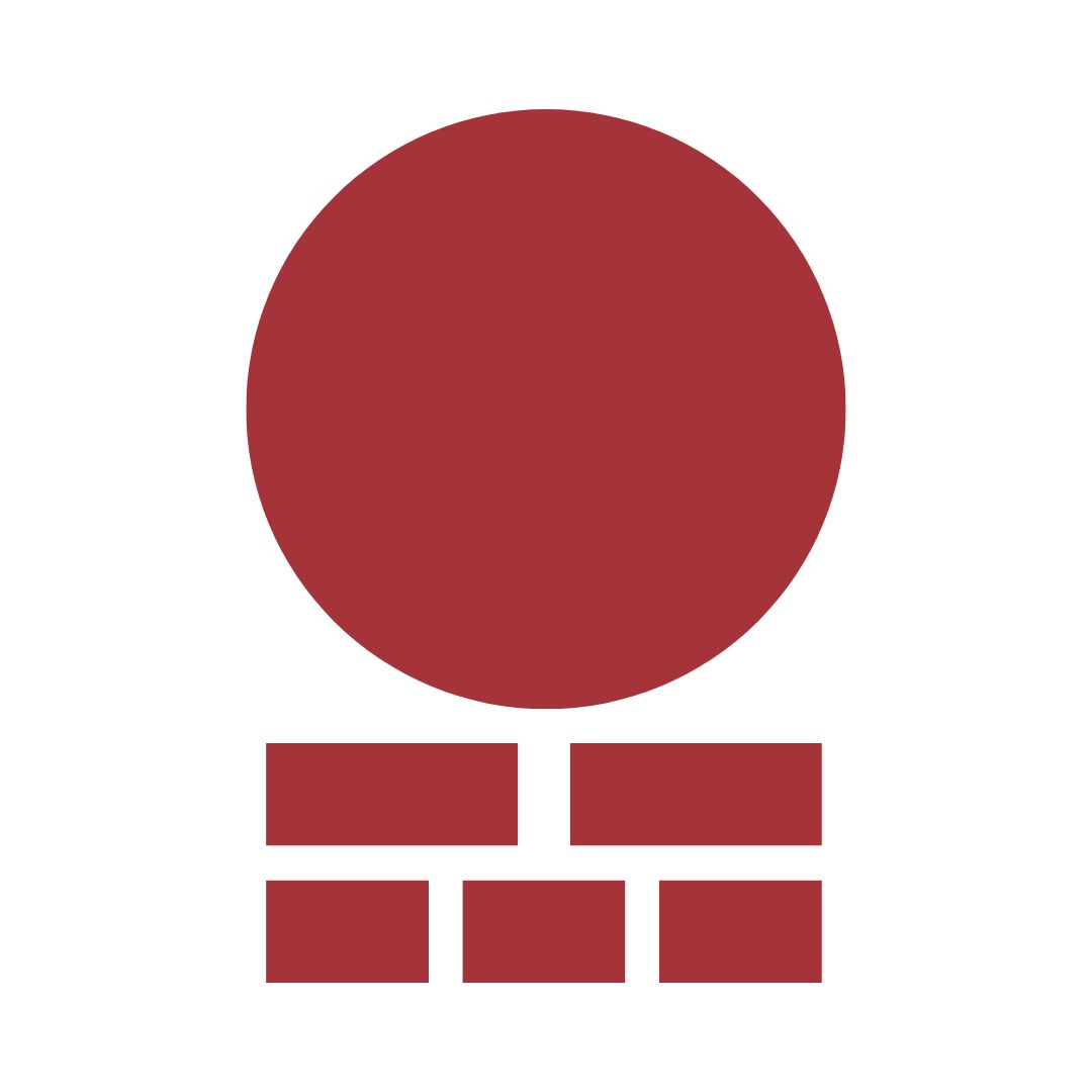
Proportion (or Scale)
Proportion is the relative size of elements to one another and to the whole. Golden ratio, rule of thirds, or just plain common sense; getting proportion right makes things feel harmonious. Exaggerated proportion (a giant chair in a photoshoot) can also be used deliberately for impact.
Unity (with Variety)
Unity means everything feels like it belongs together; variety keeps it from being boring. A consistent colour palette, typeface family, or photographic style creates unity. Strategic pops of difference add spice without breaking the family resemblance.

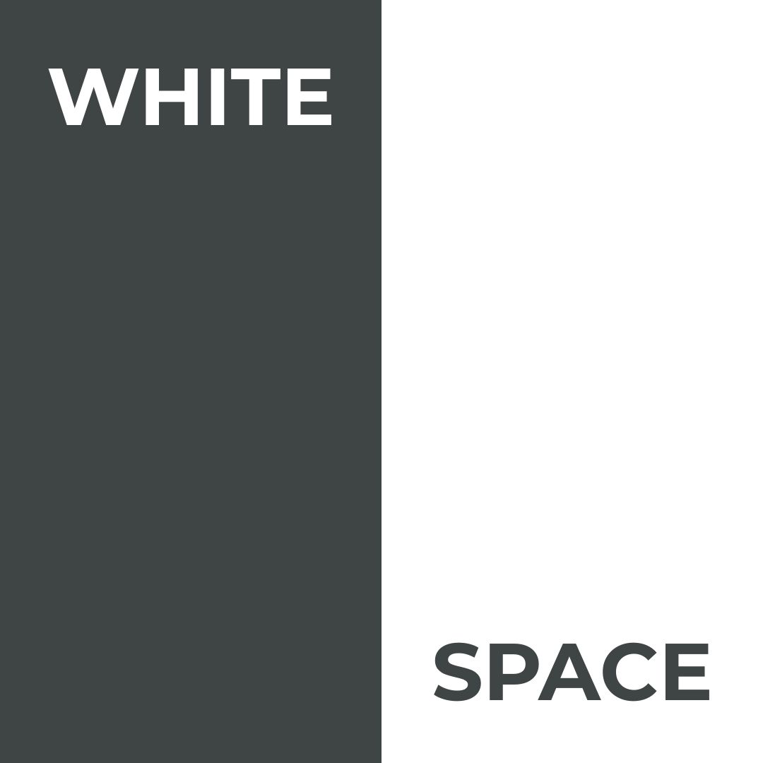
White Space (Negative Space)
The space that is deliberately left empty. It is not “nothing”; it is breathing room. Luxury brands love white space because it screams confidence: “We don’t need to fill every inch to prove our worth.”
Hierarchy
Hierarchy organises information so people understand what is most important, then next, and so on. You control it with size, colour, contrast, alignment, and spacing. A well-structured webpage hierarchy means users find what they need in seconds.
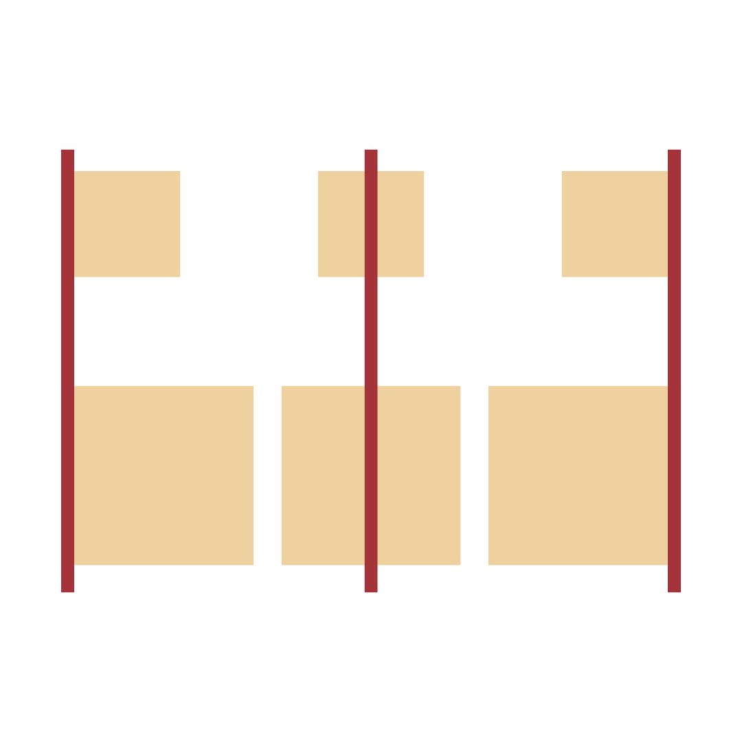
Alignment
Nothing kills professionalism faster than random alignment. Even an “organic” layout usually has an invisible grid holding it together. Proper alignment creates invisible lines that connect elements and make everything feel intentional.
How to use these principles in practice
You don’t have to think about all ten every time. Pick a goal (“this brochure should feel luxurious” → lean on white space, proportion, unity), emphasise two or three principles, and let the rest support quietly. The magic happens when they work together so well that no one notices the effort.
Next time you look at something beautiful, ask yourself: “Which principles are at play here?” You will start seeing them everywhere, and more importantly, you will start using them deliberately in your own work.
Design is not about rules for rules’ sake. These principles exist because they mirror how humans perceive order and beauty. Master them, then break them when you have a good reason. That is when true creativity begins.