
Understanding Colour Psychology in Design and Branding
Colour is one of the most immediate and powerful tools in a designer’s arsenal. The psychology of colour examines how different hues influence human emotions, perceptions, and behaviours. For businesses, this means colour choices can shape brand recognition, guide customer decisions, and even affect purchasing behaviour.
As designers, we know that getting colour right is rarely about personal preference alone. It is about understanding the subtle signals each shade sends and aligning them with the client’s goals. A mismatched palette can undermine trust or dilute a message, while a thoughtful one builds instant connection and sets the brand apart.
Why colour psychology matters for your business
Clients often come to us wanting something that “looks nice.” Yet the real value lies in using colour to support business outcomes. Studies suggest colour can influence up to 90 percent of an initial product impression. In practice, this translates to stronger brand recall, clearer communication of values, and higher engagement on websites, packaging, and marketing materials.
Consider a wellness brand: soft greens and calming blues can convey natural calm and reliability, encouraging customers to associate the products with health and balance. For an energetic food delivery service, vibrant oranges and reds signal excitement and appetite. The right palette does not just decorate; it works as a silent salesperson that reinforces the brand story at every touchpoint.
Common pitfalls we see include following trends without context or copying competitor colours without analysis. These approaches risk blending in rather than standing out. Cultural differences also matter – a colour that feels trustworthy in one market may carry different associations elsewhere. Testing palettes with the target audience and iterating based on real feedback helps avoid these issues.
Exploring key colours and their impact
Red
Evoking energy, passion, urgency, and excitement, red grabs attention quickly and can stimulate appetite or a sense of importance. It proves effective for calls to action or impulse-driven brands, though overuse may feel aggressive. Famous examples include Coca-Cola and YouTube, where red conveys bold confidence and vitality.


Blue
Communicating trust, professionalism, calmness, and reliability, blue ranks among the most versatile colours in corporate branding. It fosters feelings of security and logic, helping establish credibility without overwhelming the viewer. Think IBM, Facebook, and many financial institutions that rely on its steady presence.
Green
Symbolising growth, health, nature, freshness, and harmony, green reassures customers seeking balance, sustainability, or financial wellbeing. Brands such as Starbucks and Whole Foods use it to highlight natural qualities and environmental responsibility, creating a soothing yet optimistic presence.


Yellow
Radiating optimism, happiness, clarity, and youthfulness, yellow draws the eye and energises viewers. It can cause fatigue if overused, but brands like McDonald’s and IKEA employ it to project accessibility, cheerfulness, and approachability, making complex choices feel friendly and inviting.
Purple
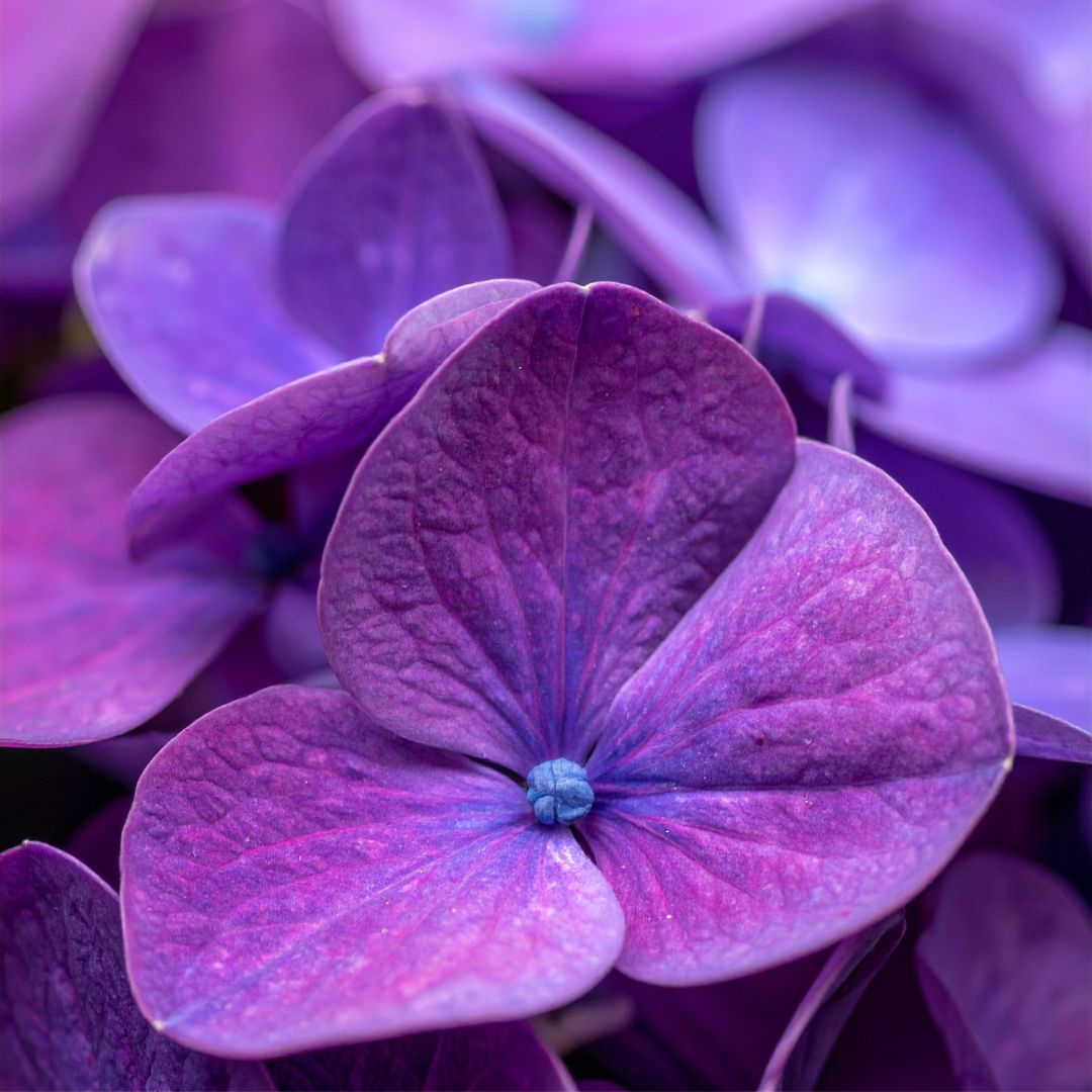
Suggesting luxury, creativity, wisdom, and imagination, purple appeals to premium or artistic audiences. It conveys a sense of mystery or sophistication. Cadbury and Yahoo have long used purple tones to stand for quality, innovation, and a touch of exclusivity.

Orange
Blending the energy of red with the friendliness of yellow, orange evokes enthusiasm, warmth, and adventure. It works well for brands that want to appear fun and approachable without being overly corporate. Fanta and Nickelodeon demonstrate how orange sparks playfulness and immediate engagement.
In real projects, I often create multiple mood boards and present them with explanations of the emotional impact. This educates clients and builds confidence in the direction. Accessibility remains essential – ensure sufficient contrast for readability and consider colour blindness.
Getting colour psychology right raises the standard of our industry. It moves design from decoration to strategic communication, delivering measurable value for clients and more satisfying results for us as professionals. The next time a client asks for “something eye-catching,” use this knowledge to deliver something that truly connects.