What is Colour Theory Basics?
Colour is one of the first things people notice about your brand, website, or product packaging. Getting the basics of colour theory right helps your business communicate clearly, evoke the right emotions, and build instant trust with your audience. When colours work together intentionally, they guide attention, reinforce your message, and make your visual identity memorable and professional – all of which directly support stronger customer connections and better business results.
For fellow designers, colour theory is not optional theory – it is the quiet discipline that separates thoughtful work from guesswork. We have all seen projects where “it just looks off” because someone chased trends without understanding harmony or contrast. Mastering these fundamentals lets us create palettes that feel inevitable rather than forced, raises the quality of client deliverables, and quietly elevates the entire industry’s standard of craft.
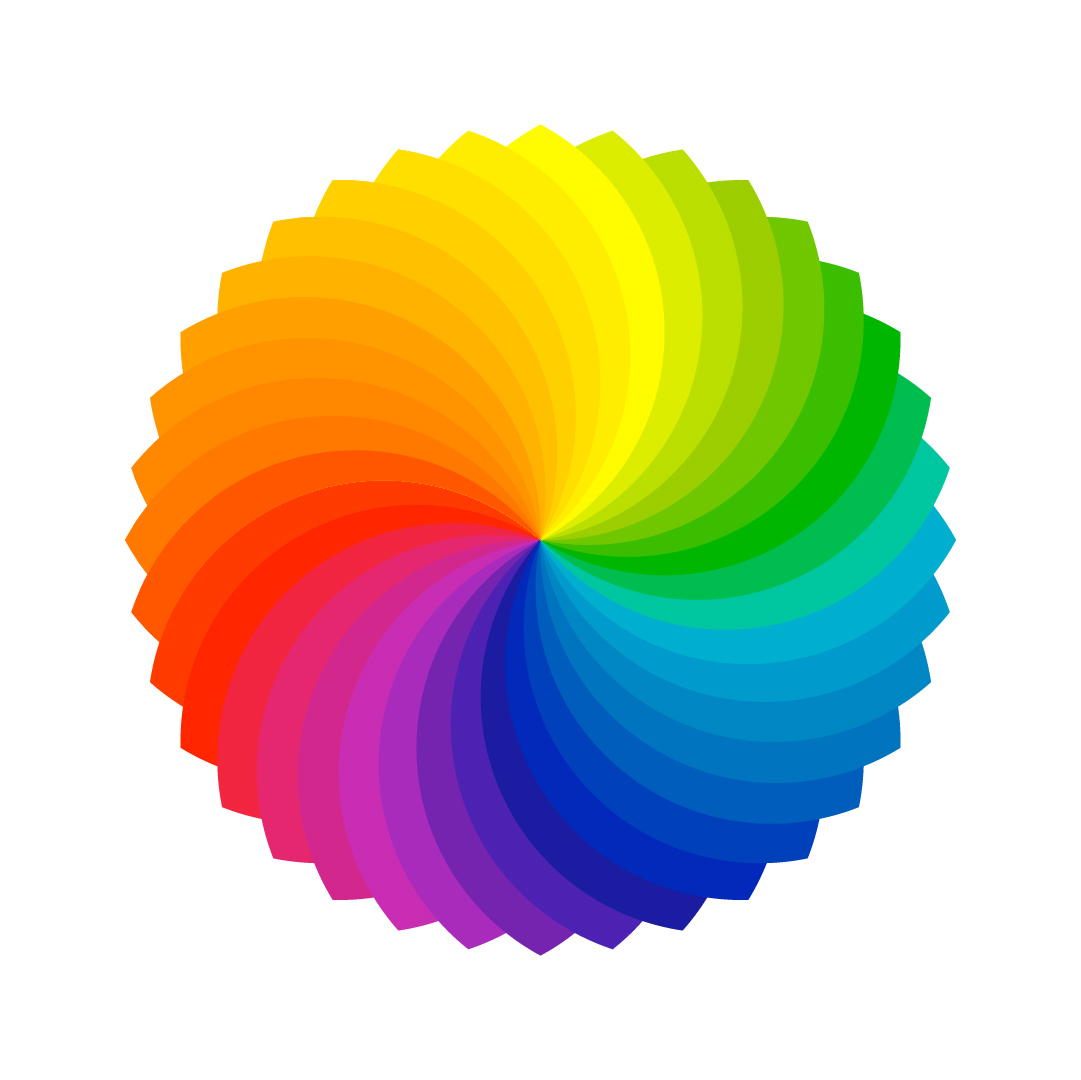
The Colour Wheel: Your Starting Map
The colour wheel organises hues in a circle to show relationships. At its core are three primary colours – red, yellow, and blue – which cannot be created by mixing others. Mixing two primaries gives secondary colours: orange (red + yellow), green (yellow + blue), and violet (blue + red). Further mixing produces tertiary colours such as red-orange, yellow-green, and blue-violet.
This wheel is practical shorthand for predicting how colours interact. Place colours opposite each other for maximum contrast (complementary schemes), or next to each other for gentle flow (analogous schemes). Clients benefit because a well-structured palette feels cohesive and purposeful, helping their brand stand out without shouting.
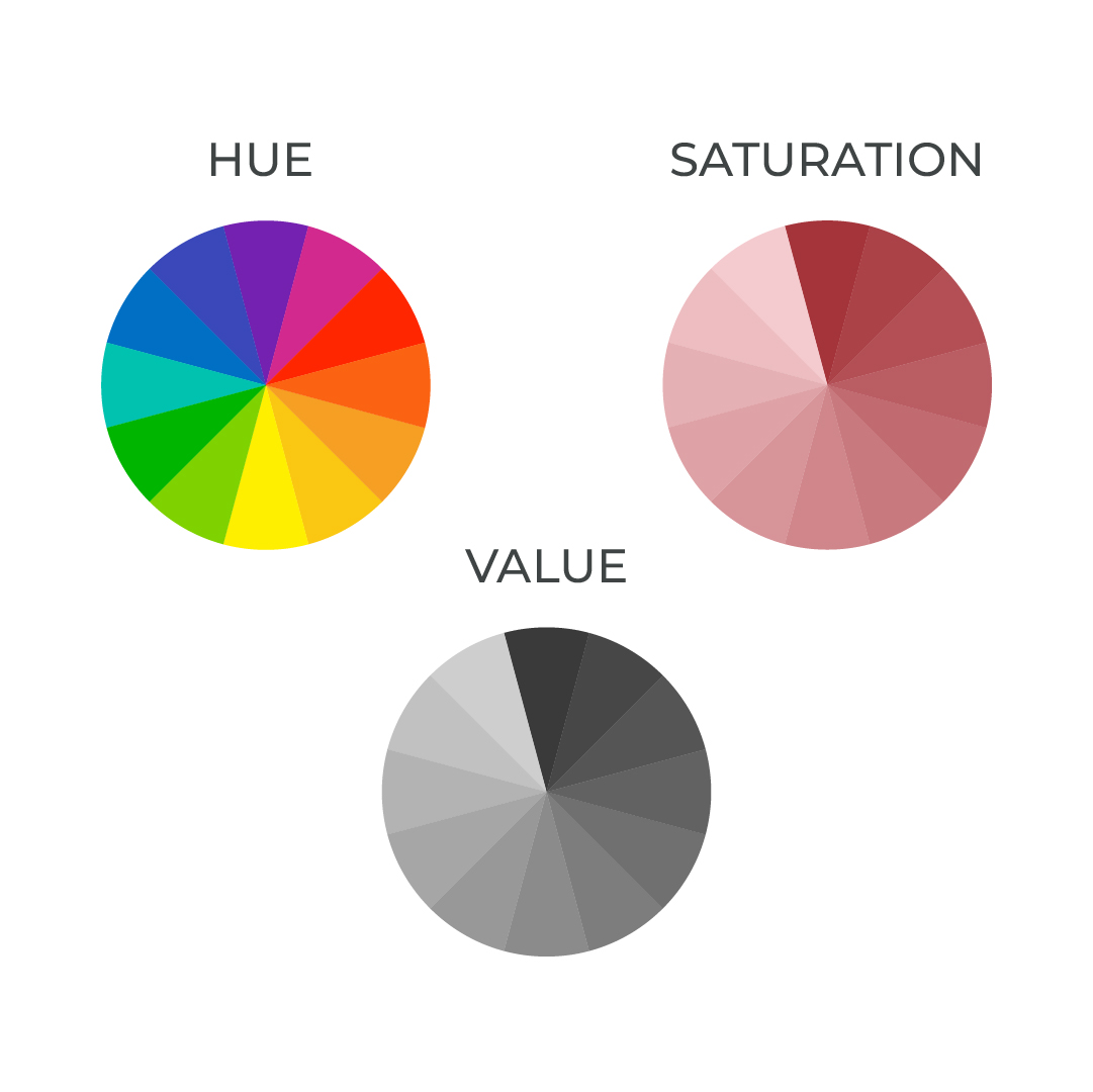
Hue, Value, and Saturation: The Real Levers
- Hue is the pure colour name (red, blue, green).
- Value describes lightness or darkness – add white for a tint, black for a shade.
- Saturation measures intensity – high saturation feels vivid and energetic, low saturation feels muted and sophisticated.
Adjusting these three creates nuance. A high-value, low-saturation palette can feel calm and premium (ideal for luxury services), while high saturation brings energy (great for youthful brands). The common pitfall is ignoring value contrast – text disappears against backgrounds when values are too similar, hurting readability and professionalism. Get this right, and accessibility improves alongside aesthetics.
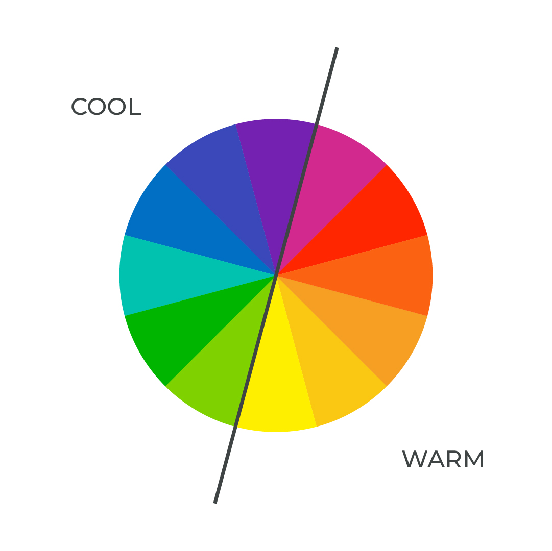
Warm vs Cool and Psychological Impact
Warm colours (reds, oranges, yellows) advance and feel energetic, while cool colours (blues, greens, purples) recede and promote calm. This is not mysticism – it is rooted in how we perceive light and nature.
For businesses, the choice matters: a fintech brand leaning cool builds trust and stability, a food delivery app using warm accents drives appetite and urgency. Designers know the trap of personal preference overriding audience needs – test palettes against real user contexts, not just your screen.
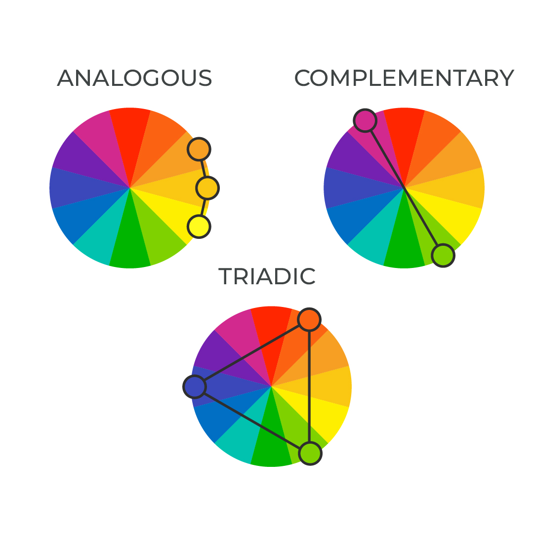
Simple schemes that work in practice
- Analogous: Three adjacent hues for harmony and ease (blue, blue-green, green for serene tech interfaces).
- Complementary: Opposites for bold contrast (blue and orange for dynamic calls to action).
- Triadic: Evenly spaced for balanced vibrancy (red, yellow, blue with one dominant).
Start with a dominant colour (60%), supporting colour (30%), and accent (10%) – this 60-30-10 rule prevents visual chaos.
Putting Colour Theory into Practice
Start every project by defining the emotional message the brand needs to convey before selecting any colour. Build a limited palette using one of the harmony schemes above, then apply the 60-30-10 rule to create balance. Test the palette in actual layouts – website mock-ups, social templates, packaging, or signage – and always check value contrast in greyscale to ensure readability across devices and lighting conditions.
For your clients, this structured approach delivers designs that feel confident and considered from the first presentation, reduces revision cycles, and creates visual identities that age gracefully while strengthening customer trust. For us as designers, it replaces guesswork with clarity, shortens project timelines, and allows us to produce work of a consistently higher standard – work that quietly lifts the quality of design across the industry.